Brushing and linking part 2 copy
CS 7280: Special Topics in Information Visualization
Homework 4 - Part 2: Brushing and Linking
The idea of linking and brushing is to combine different visualization methods to overcome the shortcomings of single techniques. Interactive changes made in one visualization are automatically reflected in the other visualizations. Two of these several techniques are Brushing and Linking.
Brushing refers to several interaction techniques that allow the user to select a subset of data in a visualization. By Linking, we mean showing how a point, or set of points, behaves in each of the plots. This is accomplished by highlighting these points in some fashion.
Dataset
I have selected the GDP information of Top 7 countries (by GDP) during the year 2013, 2015 and 2016. For the second visualization, I have used the Boston temperature data for the past week (Nov 2, 2016 - Nov 8, 2016).
Data Source: List of Countries by Projected GDP
Data Source: Boston Temperature Data
Dataset snapshot:
Cleaning Dataset
The inital cleaning steps involved selecting the date and the GDP column from the dataset. Then, the dataset was filtered to capture data for Top 7 countries. The format of the date column was changed to Year and the GDP column was changed to numeric. Preliminary exploration of the data was performed in Excel. I have rounded the GDP value to the closest 500 multiple for ease of use.
Interactive Visualizations
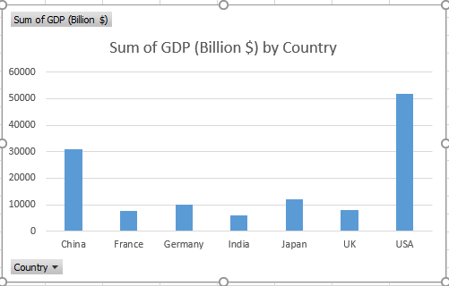
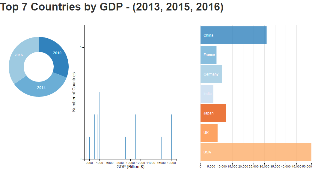
An interactive visualization of Brushing and Linking using Bar Chart, Pie Chart I have tried to represent the technique of Brushing and Linking using 3 views in the same plot. Every view is linked and interactive. The Pie Chart and Bar Chart offer information (Detail-on-Demand) through the use of tool-tip. Hovering over the charts, provides the actual numeric value for that country.
Link to Visualization: GDP Visualization
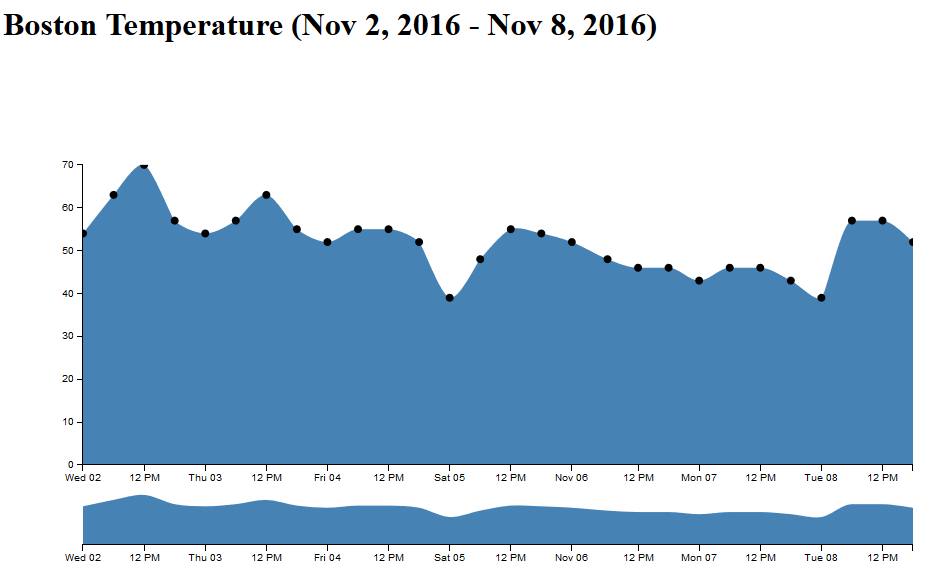
An interactive visualization of Brushing and Linking using Area Chart I have tried to represent the technique of Brushing and Linking using an area chart with a timeline at the bottom of the chart which can be selected using a brush. The data points are represented by black circles which when hovered on provides the exact temperature (Detail-on-Demand) recorded for that time.
Link to Visualization: Temperature Visualization
- Design Decisions Bar chart was a good choice here to represent the information regarding the Total GDP Vs Country as we have few categories (7) however a range of numerical values for the GDP. I used pie chart to represent the information about share of GDP in each year. Donut Pie chart is useful here as the categories are less (only 3 years), therefore it provides a compact way to view this information. The second bar chart is used to identify the number of countries with GDP in the selected range.
Source Code of Interactive Visualizations: Brushing and Linking
Author: Harshali Singh