Color education
CS 7280: Special Topics in Information Visualization
Homework 3 - Part 2: Color Maps
The graphic display of data plays a critical role in information visualization. Appropriate use of color for data display allows interrelationships and patterns within data to be easily observed. An inappropriate use use of color will will obscure, muddle and confuse these patterns.
There are three main types of Color Maps and we will see examples of visualizations which demonstrates an appropriate and an inappropriate use of the color map.
Categorical Color Map
The categorical color maps (also known as nominal color maps) are used to represent a collection of discrete, unordered classes. Since the colors have no ordering (by design), they are not appropriate for mapping a scalar variable.
A visualization example of an appropriate use of Categorical Color Map
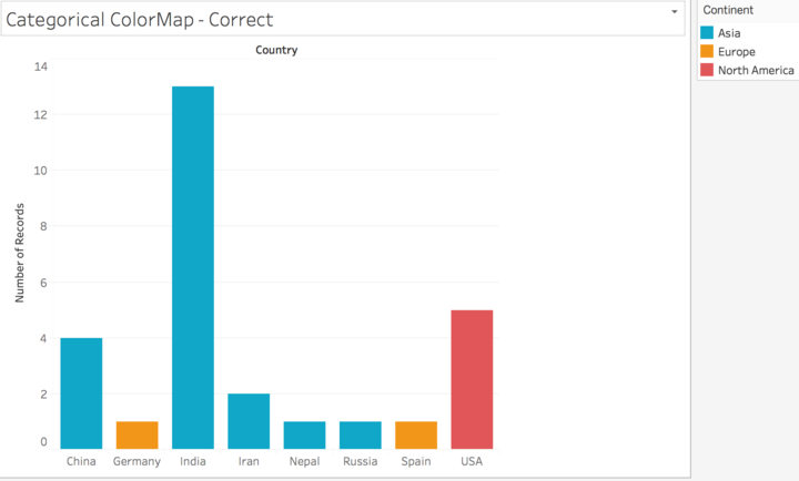
Data Source: CS7280-01 HW0 Class Informational Survey
A visualization example of an inappropriate use of Categorical Color Map
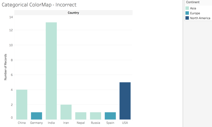
Data Source: CS7280-01 HW0 Class Informational Survey
Sequential Color Map
The sequential color maps (also known as ordinal or saturation color maps) are (nearly) monochromatic. They range from a heavily saturated color to various levels of unsaturation. Luminance is also often increased as saturation is decreased so that the color map terminates in a color at or close to white. The monotonic nature of the saturation level maps well to a scalar value.
A visualization example of an appropriate use of Sequential Color Map
Interactive Visualization Link: Independent Farms in the USA
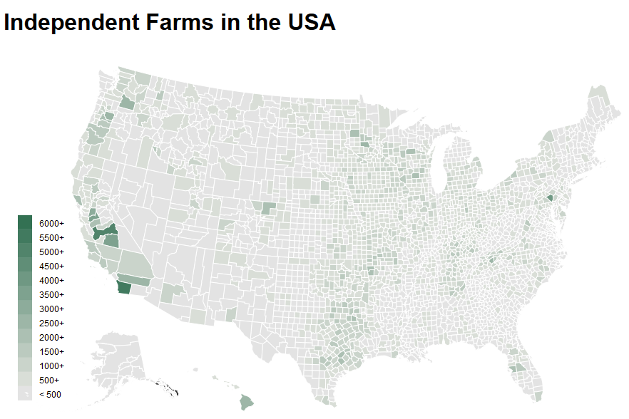
Data Source: Agriculture Data
A visualization example of an inappropriate use of Sequential Color Map
Interactive Visualization Link: US Population of Different States by Age Group
Please view visualization in Mozilla Firefox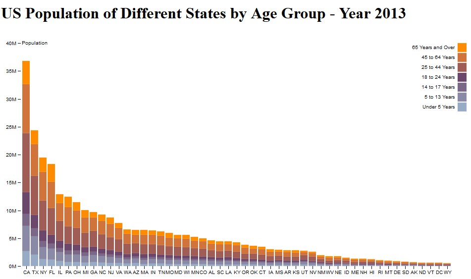
Data Source: US Population of Different States by Age Group data
Diverging Color Map
The diverging color maps (also known as ratio, bipolar, or double-ended) have two major color components. The map transitions from one color component to the other by passing through an unsaturated color (white or yellow). Diverging color maps are typically used to represent a scalar with a significant value at or near the median. For example, a color map for elevation could put sea level at white with below sea level in blue and above sea level in tan. There is equal emphasis on mid-range critical values and extremes at both ends of the data range. The ordering of the colors is usually based on the context within which they are used.
A visualization example of an appropriate use of Diverging Color Map
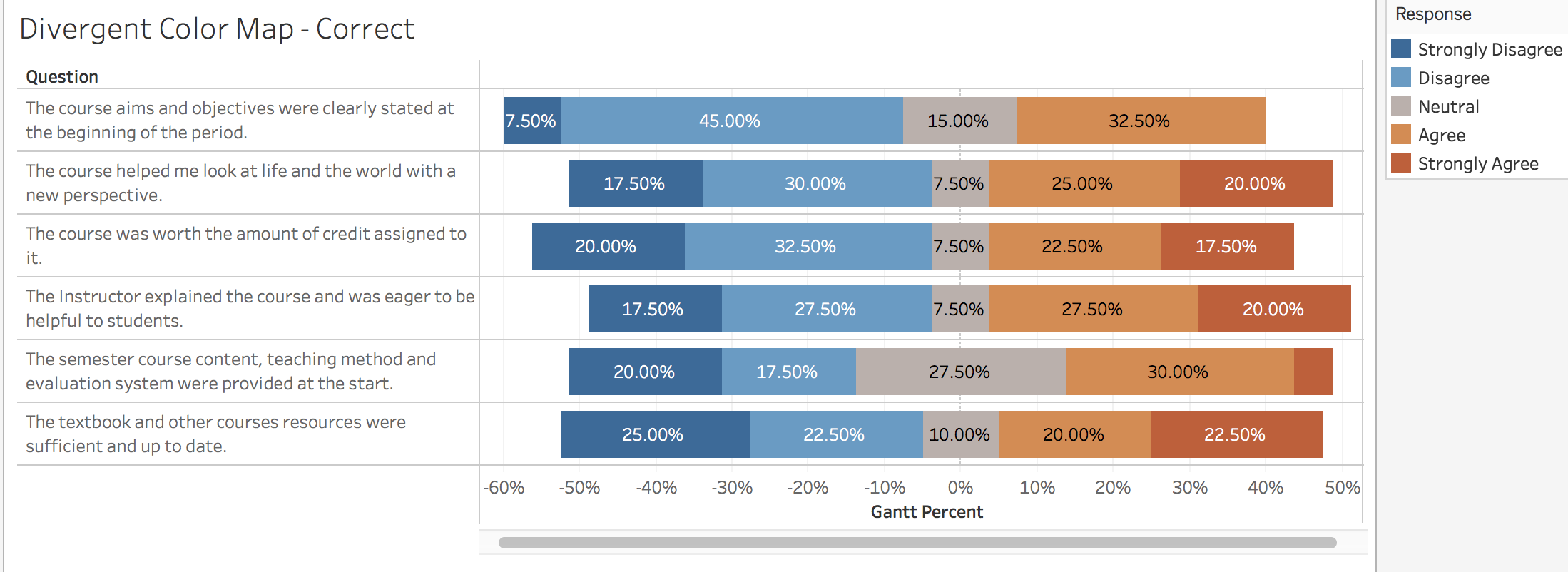
Data Source: Turkiye Student Evaluation
A visualization example of an inappropriate use of Diverging Color Map
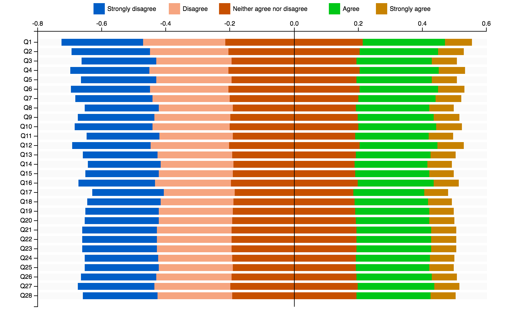
Data Source: Turkiye Student Evaluation
Source Code of Interactive Visualizations: Sequential Color Maps
Authors: Harshali Singh, Vishal Mehta, Bhavin Vora