CS 7280: Special Topics in Information Visualization
Homework 5 - Part 1: Game Analytics
Dataset
adjacenecy-matrix.csv : Data to represent the graph
edge-list.csv : Data to represent the edges in the graph
game-log.csv : The player’s actions (in chronological order)
Interactive Visualizations
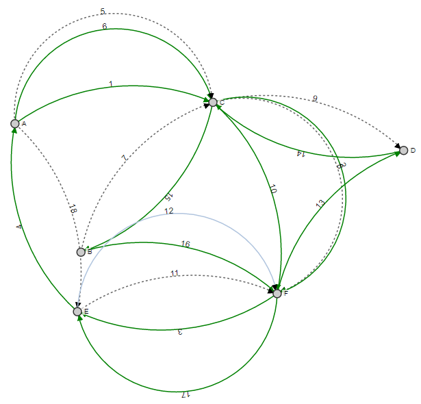
I have used a Force - Directed Graph to represent the players’ steps in the game. The circles represent the nodes and the edges represent the paths which the player selects. The marker end of the edge helps to identify the direction of the edge. I have used different stroke format for the edges to encode the player step (e.g. solid green edge for “move”, dashed black edge for “mark edge” and solid blue edge for “unmark edge”). Additionally, to display the chronological order of steps taken, the edges have been marked with the order number in which the step was taken.
(If unable to view the visualization in Google Chrome, please enable “Load Unsafe Scripts” in the URL bar.)
Design Decisions
The visualization is interactive as we can move the nodes around to visualize the edges clearly as well as the graph rearranges itself after any interaction. A user can take multiple paths from one node to another including different steps so a dynamic visualization is a better choice here as it provides a way to change the orientation of the nodes to view overlapping edges clearly. I used numbers as labels on the edges to represent the chronological order as it helps to bring information closer to the visualization while keeping the clutter in the graph to minimum. Usage of different strokes for the edges eliminates the need of labeling the edges with step type without losing any data. I chose to represent the edges as an arc instead of straight line because there are multiple edges between some nodes (e.g. node A and node C), and arcs with different radius solves the issue of overlapping edges.
CS 7280: Special Topics in Information Visualization
Homework 4 - Part 2: Brushing and Linking
The idea of linking and brushing is to combine different visualization methods to overcome the shortcomings of single techniques. Interactive changes made in one visualization are automatically reflected in the other visualizations. Two of these several techniques are Brushing and Linking.
Brushing refers to several interaction techniques that allow the user to select a subset of data in a visualization. By Linking, we mean showing how a point, or set of points, behaves in each of the plots. This is accomplished by highlighting these points in some fashion.
Dataset
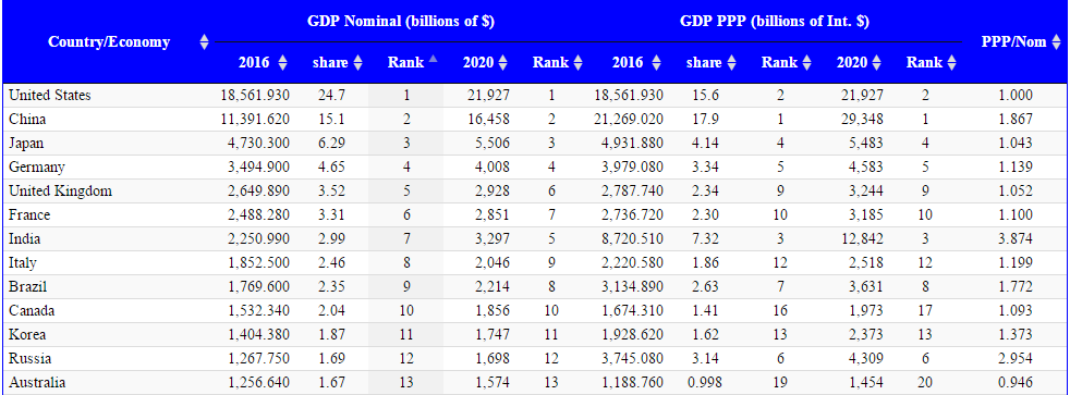
I have selected the GDP information of Top 7 countries (by GDP) during the year 2013, 2015 and 2016.
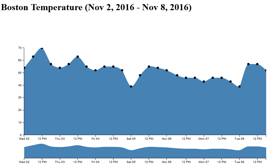
For the second visualization, I have used the Boston temperature data for the past week (Nov 2, 2016 - Nov 8, 2016).
The inital cleaning steps involved selecting the date and the GDP column from the dataset. Then, the dataset was filtered to capture data for Top 7 countries. The format of the date column was changed to Year and the GDP column was changed to numeric. Preliminary exploration of the data was performed in Excel. I have rounded the GDP value to the closest 500 multiple for ease of use.
Interactive Visualizations
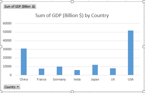
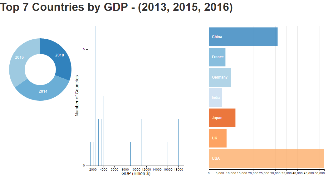
An interactive visualization of Brushing and Linking using Bar Chart, Pie Chart
I have tried to represent the technique of Brushing and Linking using 3 views in the same plot.
Every view is linked and interactive. The Pie Chart and Bar Chart offer information (Detail-on-Demand) through the use of tool-tip. Hovering over the charts, provides the actual numeric value for that country.
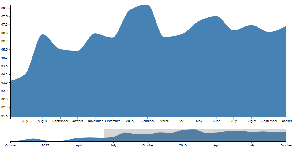
An interactive visualization of Brushing and Linking using Area Chart
I have tried to represent the technique of Brushing and Linking using an area chart with a timeline at the bottom of the chart which can be selected using a brush. The data points are represented by black circles which when hovered on provides the exact temperature (Detail-on-Demand) recorded for that time.
Design Decisions
Bar chart was a good choice here to represent the information regarding the Total GDP Vs Country as we have few categories (7) however a range of numerical values for the GDP.
I used pie chart to represent the information about share of GDP in each year. Donut Pie chart is useful here as the categories are less (only 3 years), therefore it provides a compact way to view this information.
The second bar chart is used to identify the number of countries with GDP in the selected range.
CS 7280: Special Topics in Information Visualization
Homework 4 - Part 2: Brushing and Linking
The idea of linking and brushing is to combine different visualization methods to overcome the shortcomings of single techniques. Interactive changes made in one visualization are automatically reflected in the other visualizations. Two of these several techniques are Brushing and Linking.
Brushing refers to several interaction techniques that allow the user to select a subset of data in a visualization. By Linking, we mean showing how a point, or set of points, behaves in each of the plots. This is accomplished by highlighting these points in some fashion.
Dataset
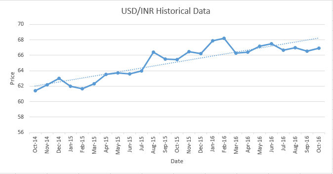
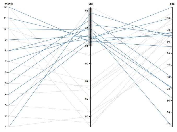
As an international student living in US, the increase and fall of the Indian Rupee to US Dollar Exchange Rate is of utmost importance to me due to financial reasons. The rate helps me make a very important decision regarding when to transfer money to or from my parents in India. Therefore, I have chosen the dataset of INR - USD Conversion rate for the past 2 years (Sept 2014 - Sept 2016), i.e. since I moved to US for my higher studies.
The inital cleaning steps involved selecting the date and the price column from the dataset. Then, the dataset was filtered to capture data between Sept 2014 - Sept 2016. The format of the date column was changed to Date and the price column was changed to numeric. Preliminary exploration of the data was performed in Excel and from the below chart, we can understand how US Dollar has increasingly become expensive compared to Indian Rupee over a period of 24 months.
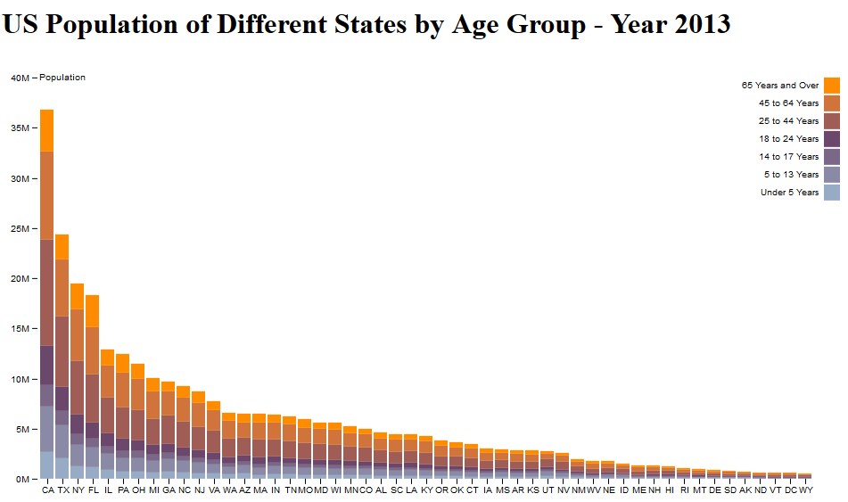
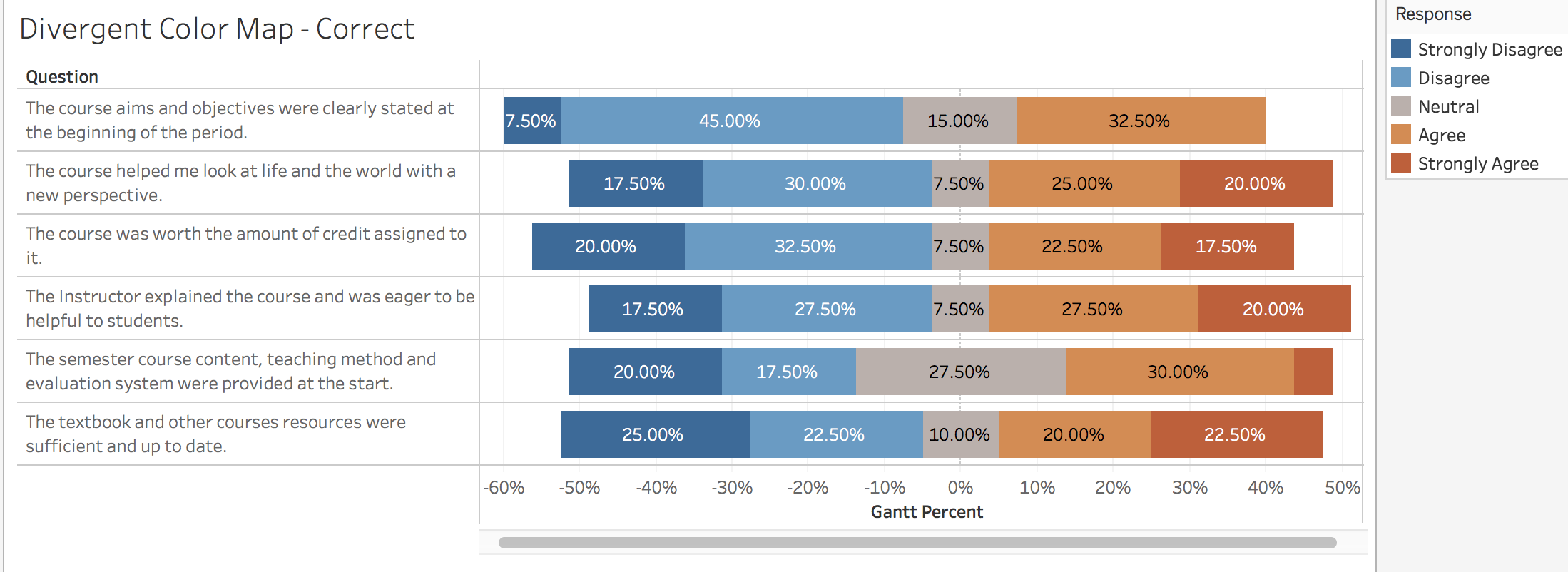
CS 7280: Special Topics in Information Visualization
Homework 3 - Part 2: Color Maps
The graphic display of data plays a critical role in information visualization. Appropriate use of color for data display allows interrelationships and patterns within data to be easily observed. An inappropriate use use of color will will obscure, muddle and confuse these patterns.
There are three main types of Color Maps and we will see examples of visualizations which demonstrates an appropriate and an inappropriate use of the color map.
Categorical Color Map
The categorical color maps (also known as nominal color maps) are used to represent a collection of discrete, unordered classes. Since the colors have no ordering (by design), they are not appropriate for mapping a scalar variable.
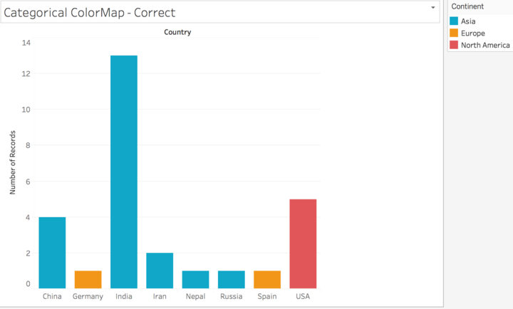
A visualization example of an appropriate use of Categorical Color Map
Data Source: CS7280-01 HW0 Class Informational Survey
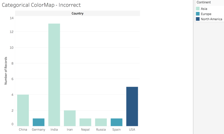
A visualization example of an inappropriate use of Categorical Color Map
Data Source: CS7280-01 HW0 Class Informational Survey
Sequential Color Map
The sequential color maps (also known as ordinal or saturation color maps) are (nearly) monochromatic. They range from a heavily saturated color to various levels of unsaturation. Luminance is also often increased as saturation is decreased so that the color map terminates in a color at or close to white. The monotonic nature of the saturation level maps well to a scalar value.
A visualization example of an appropriate use of Sequential Color Map
The diverging color maps (also known as ratio, bipolar, or double-ended) have two major color components. The map transitions from one color component to the other by passing through an unsaturated color (white or yellow). Diverging color maps are typically used to represent a scalar with a significant value at or near the median. For example, a color map for elevation could put sea level at white with below sea level in blue and above sea level in tan. There is equal emphasis on mid-range critical values and extremes at both ends of the data range. The ordering of the colors is usually based on the context within which they are used.
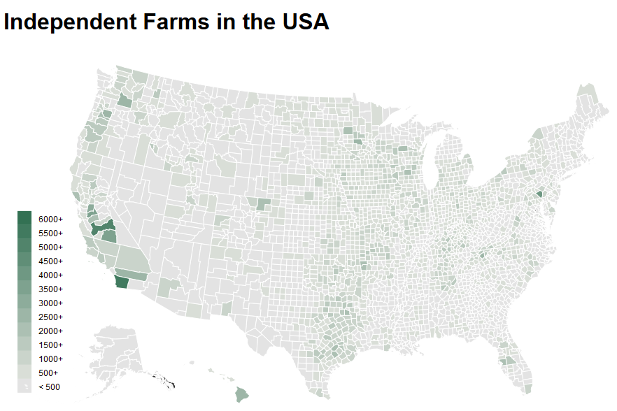
A visualization example of an appropriate use of Diverging Color Map
Howdy! This is an example blog post that shows several types of HTML content supported in this theme.
Cum sociis natoque penatibus et magnis dis parturient montes, nascetur ridiculus mus. Aenean eu leo quam. Pellentesque ornare sem lacinia quam venenatis vestibulum. Sed posuere consectetur est at lobortis. Cras mattis consectetur purus sit amet fermentum.
Curabitur blandit tempus porttitor. Nullam quis risus eget urna mollis ornare vel eu leo. Nullam id dolor id nibh ultricies vehicula ut id elit.
Etiam porta sem malesuada magna mollis euismod. Cras mattis consectetur purus sit amet fermentum. Aenean lacinia bibendum nulla sed consectetur.
Inline HTML elements
HTML defines a long list of available inline tags, a complete list of which can be found on the Mozilla Developer Network.
To bold text, use <strong>.
To italicize text, use <em>.
Abbreviations, like HTML should use <abbr>, with an optional title attribute for the full phrase.
Citations, like — Mark otto, should use <cite>.
Deleted text should use <del> and inserted text should use <ins>.
Superscript text uses <sup> and subscript text uses <sub>.
Most of these elements are styled by browsers with few modifications on our part.
Heading
Vivamus sagittis lacus vel augue rutrum faucibus dolor auctor. Duis mollis, est non commodo luctus, nisi erat porttitor ligula, eget lacinia odio sem nec elit. Morbi leo risus, porta ac consectetur ac, vestibulum at eros.
Code
Cum sociis natoque penatibus et magnis dis code element montes, nascetur ridiculus mus.
// Example can be run directly in your JavaScript console
// Create a function that takes two arguments and returns the sum of those arguments
varadder=newFunction("a","b","return a + b");// Call the function
adder(2,6);// > 8
Aenean lacinia bibendum nulla sed consectetur. Etiam porta sem malesuada magna mollis euismod. Fusce dapibus, tellus ac cursus commodo, tortor mauris condimentum nibh, ut fermentum massa.
Lists
Cum sociis natoque penatibus et magnis dis parturient montes, nascetur ridiculus mus. Aenean lacinia bibendum nulla sed consectetur. Etiam porta sem malesuada magna mollis euismod. Fusce dapibus, tellus ac cursus commodo, tortor mauris condimentum nibh, ut fermentum massa justo sit amet risus.
Praesent commodo cursus magna, vel scelerisque nisl consectetur et.
Donec id elit non mi porta gravida at eget metus.
Nulla vitae elit libero, a pharetra augue.
Donec ullamcorper nulla non metus auctor fringilla. Nulla vitae elit libero, a pharetra augue.
Vestibulum id ligula porta felis euismod semper.
Cum sociis natoque penatibus et magnis dis parturient montes, nascetur ridiculus mus.
Maecenas sed diam eget risus varius blandit sit amet non magna.
Cras mattis consectetur purus sit amet fermentum. Sed posuere consectetur est at lobortis.
HyperText Markup Language (HTML)
The language used to describe and define the content of a Web page
Cascading Style Sheets (CSS)
Used to describe the appearance of Web content
JavaScript (JS)
The programming language used to build advanced Web sites and applications
Integer posuere erat a ante venenatis dapibus posuere velit aliquet. Morbi leo risus, porta ac consectetur ac, vestibulum at eros. Nullam quis risus eget urna mollis ornare vel eu leo.
Tables
Aenean lacinia bibendum nulla sed consectetur. Lorem ipsum dolor sit amet, consectetur adipiscing elit.
Name
Upvotes
Downvotes
Totals
21
23
Alice
10
11
Bob
4
3
Charlie
7
9
Nullam id dolor id nibh ultricies vehicula ut id elit. Sed posuere consectetur est at lobortis. Nullam quis risus eget urna mollis ornare vel eu leo.